Services
- →Conversion-focused landing page architecture and UX
- →WordPress development — single long-form landing page
- →Copywriting structure: hero, product story, how-it-works, testimonials, lead form
- →Design in a calm, trust-building colour palette (teal, gold, neutral)
- →Lead capture form setup with client notification
Deliverables
- ✓Single-page WordPress landing with full conversion funnel
- ✓Three-step "How It Works" section replacing repetitive cold-call explanations
- ✓Testimonials block with buyer photos, names, cities, and first-person narratives
- ✓Two-field lead form (name + phone) — 24/7 self-service enquiry capture
Challenge
The client sold a single product — a Chinese energy-charged money talisman — but had no digital storefront. Every sale began with a phone call. Cold visitors who found the product through ads or word of mouth had nowhere to land, read, and decide. Without social proof or a structured purchase path, potential buyers dropped off before ever reaching out.
Discovery
Interviewing the client revealed three things cold visitors needed before converting:
- A credible product story — the talisman's origin, ritual significance, and activation instructions. Without this, the product felt abstract and untrustworthy.
- Social proof from real buyers — testimonials with names, cities, and specific results were the single biggest trust signal for this audience.
- A frictionless next step — not a cart, not a payment form; just a name and phone number. The client preferred to close by call, so the goal was to capture the lead, not complete a transaction.
The buying journey was linear and emotional, not rational and feature-driven. The page architecture had to follow that journey.
Options Considered
- Full e-commerce store (WooCommerce) — rejected. The client sold one product with a consultative close. A checkout flow added friction and complexity with no conversion benefit.
- Social media only (VK / Instagram) — rejected. No control over layout, no SEO surface, no persistent URL for ad campaigns.
- Single-page WordPress landing — chosen. Fast to build, easy for the client to update testimonials and copy independently, and purpose-built for a single conversion action: submit a contact form.
Decision
A single long-form WordPress landing page structured as a narrative funnel: hook in the hero, product description with ritual context, three-step "how it works" process, social proof via buyer testimonials, and a closing lead form. Every section answered one objection and moved the visitor to the next.
The colour palette — warm teals, golds, and neutrals — was chosen to feel calm and trustworthy without the hard-sell energy typical of the niche. The design reinforced the product's positioning as a considered, heritage-backed purchase rather than an impulse buy.
Implementation
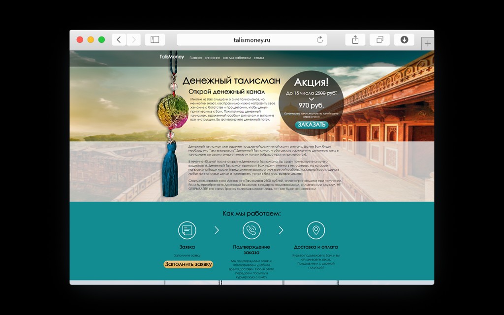
The hero section led with the product name, a concise value headline, and a prominent discount offer with a countdown-style urgency element — standard for direct-response landings in this market. The CTA button linked directly to the lead form at the bottom, keeping the scroll path short.
The product description section used plain language to explain the talisman's origins, activation ritual, and the expected timeline for results. This copy reduced post-purchase anxiety and pre-answered the questions the client's team was answering by phone on every call.
The "How It Works" section reduced the purchase to three steps — Submit a form → Order confirmation → Delivery and payment — removing ambiguity about what happened after the form was filled. A clear CTA button sat below this block.
Three testimonials with buyer photos, names, ages, cities, and first-person narratives occupied the social proof block. Each story followed the same arc: scepticism, purchase, specific positive outcome. The specificity — named cities, concrete results — made them credible rather than generic.
The closing section was a minimal two-field form (name + phone) with a single submit button. Keeping the form short maximised completion rates for a cold-traffic audience.
Outcome
The landing replaced phone-first discovery with a self-service information path. Visitors could read, evaluate, and express intent on their own schedule — including outside business hours. The client's team shifted from explaining the product on every cold call to following up with already-informed leads. Lead form submissions became the primary acquisition metric, measurable and attributable to ad spend for the first time.
Site Overview
Full Landing Page

Desktop View
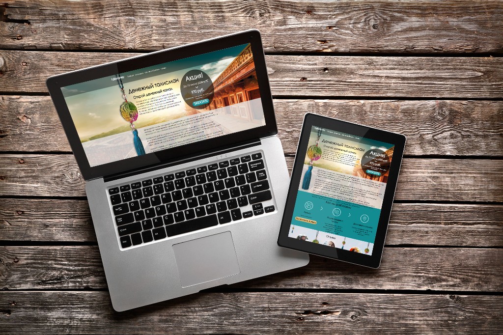
Responsive Mockup
Open for contract collaboration
I am available for contract-based collaboration. If you have an interesting project idea, schedule a call via Calendly.
Schedule a 30-min call